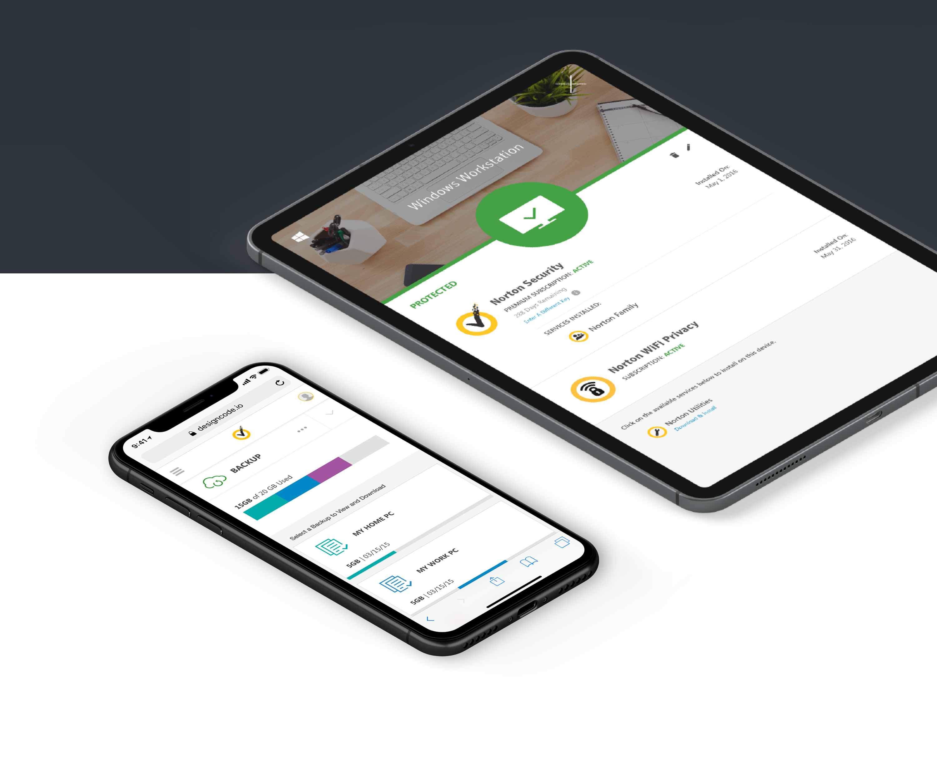
The first dashboard from Norton to unite all products under the same subscription.
Product DesignDesign SystemsWeb
Challenge
Norton's product lines were growing quickly to provide comprehensive cybercrime protection, but products like Norton Security, Norton WiFi Privacy, and Norton Backup each required separate setup and monitoring through their own portal.
Before this portal, users had to sign in to a different page for every product just to check a subscription, add a device, or manage a backup.
The Unification Initiative set out to build one web dashboard with centralized control over every user entitlement.
Users
Primary: Subscription Admin
Manages billing and can add or remove users on the household subscription.
Secondary: Household Member
Shares the same device count and backup storage as everyone else on the subscription.
My Role
Product Designer: owned the Unification Initiative's interface end-to-end, from information architecture through a complete color and brand system that would carry across every Norton product screen.
Design and Product Decisions
Replaced five separate product sign-ins with one my.norton.com login, organized into Home, Device, and Backup tabs.
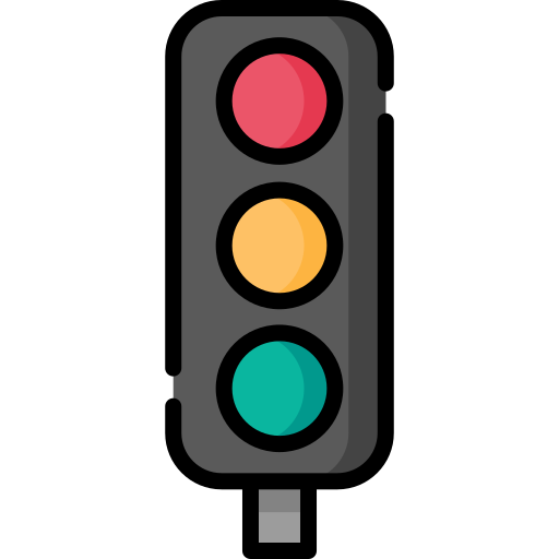
Designed a consistent Safe, Warning, and Danger state system so users could read device health at a glance across every product.
Gave every household member shared visibility into total device count and backup storage, with one Admin able to manage billing for everyone.
Color Guideline
I built a full color system for the team: brand and functional colors for every UI state, plus eight accent families with a full tint range, so any designer could extend the portal consistently.
Brand Colors
Norton Yellow
#FDBB30
Norton Black
#000000
Functional Colors
Link Blue
#0188C6
Button Yellow
#FEE189
Safe Green
#339933
Warning Orange
#F9622F
Danger Red
#C61D13
Disabled Grey
#E2E2E2
Loading Blue
#0188C6
Text Grey 1
#A0A0A0
Text Grey 2
#585858
Text Grey 3
#434343
Accent Colors
Teal
Cyan
Indigo
Purple
Magenta
Rust
Goldenrod
Brown
Final Design
Five core views made up the portal: Home, Devices, a device's details, Backup, and a backup set's details.
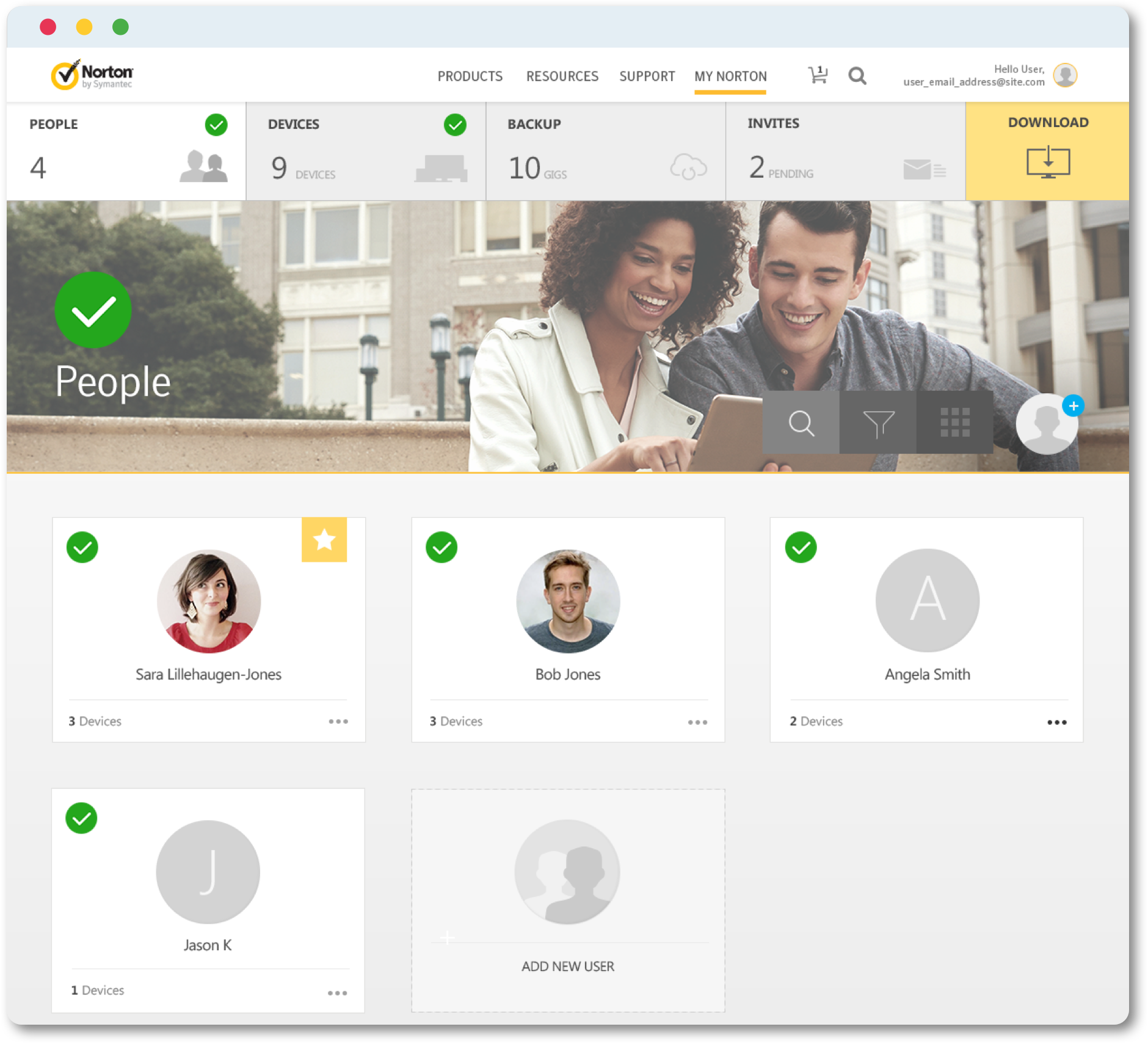
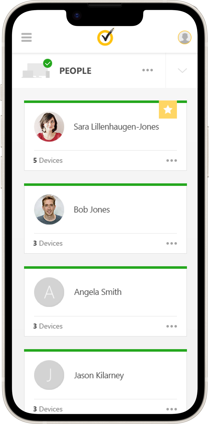
Home
Every user on the subscription, the Admin marked with a star. Only the Admin manages billing, but device count and backup storage are shared by all.
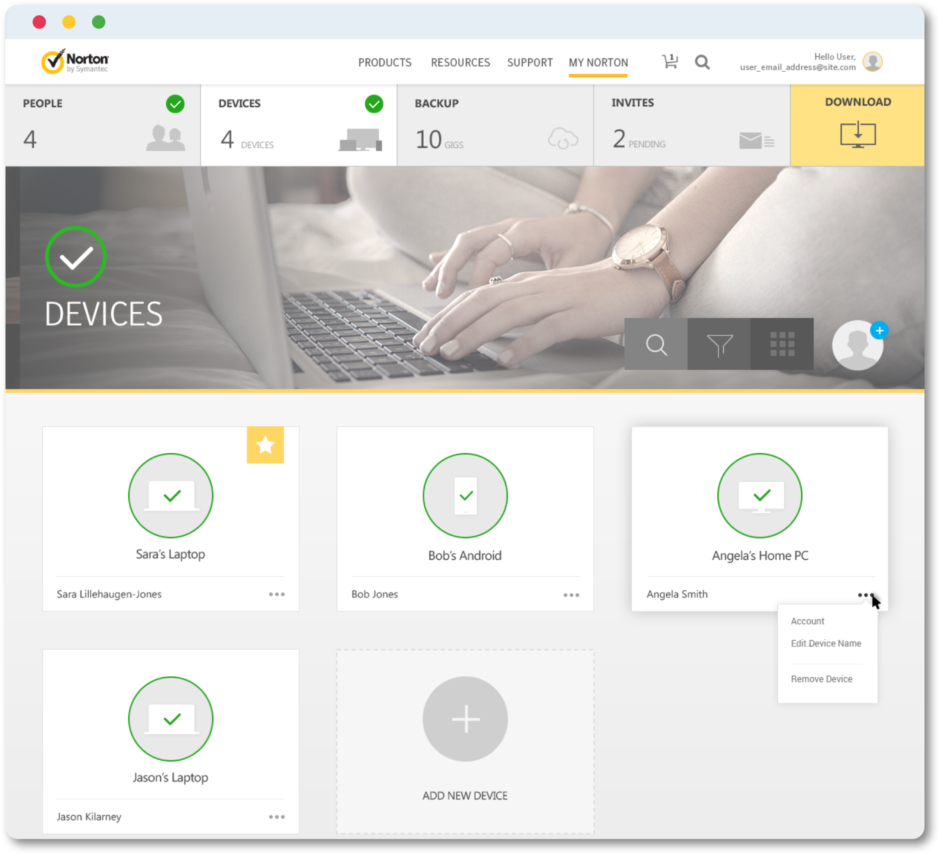
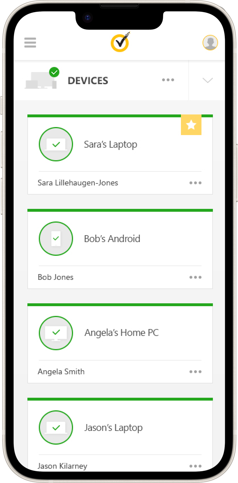
Devices
Every device from every user, in one list. Anyone can add another straight from the Add New Device card.
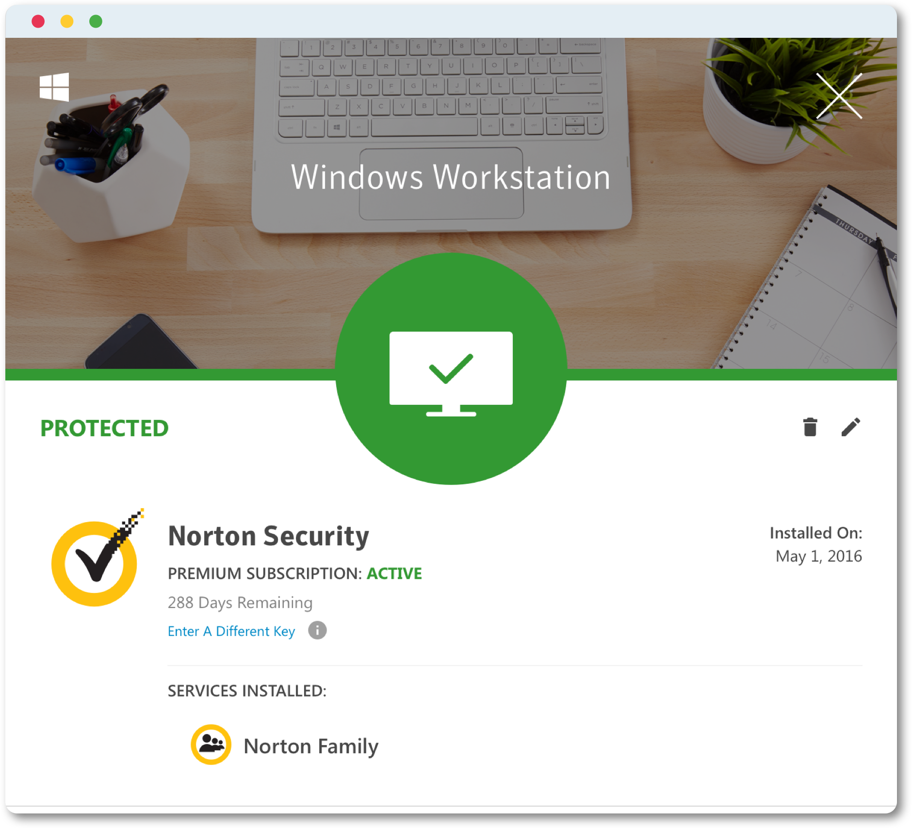
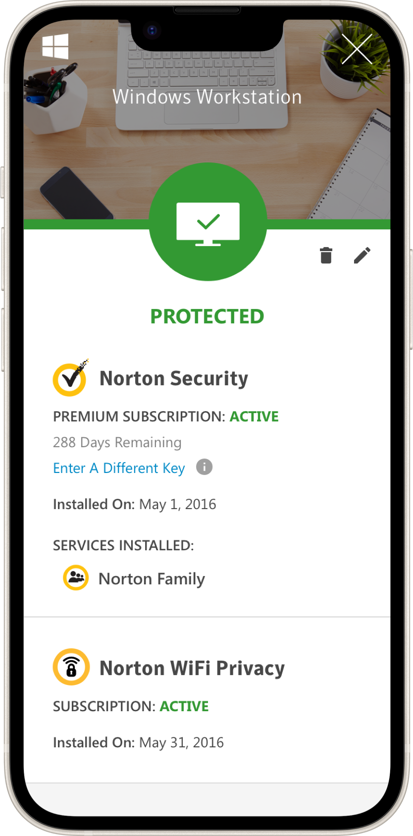
Device Details
Clicking any device opens its status view: Safe, Warning, or Danger, each with the exact next step to take.
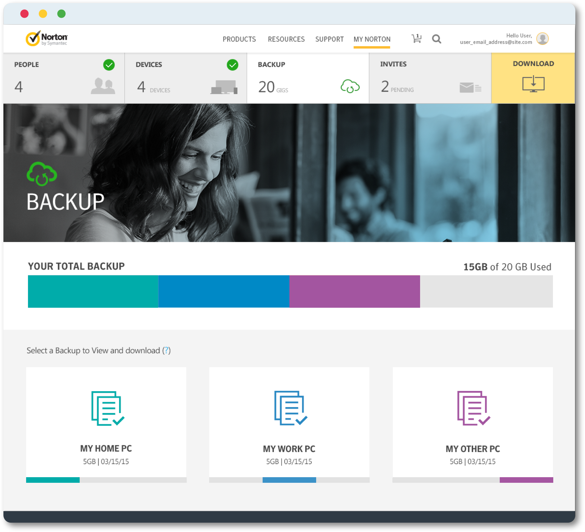
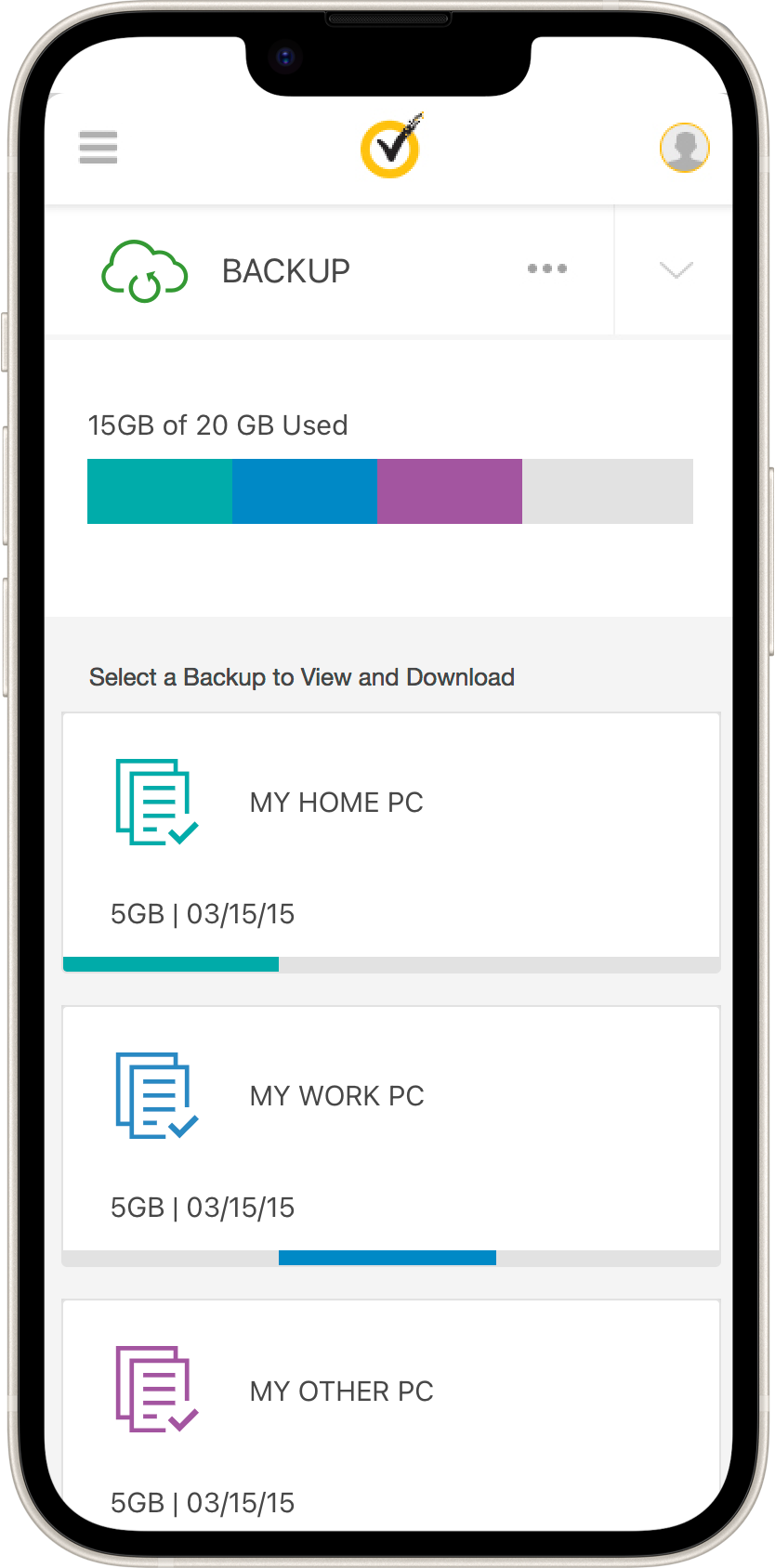
Backup
Every backup under the subscription, available to any user with PC protection, with storage shared across everyone.
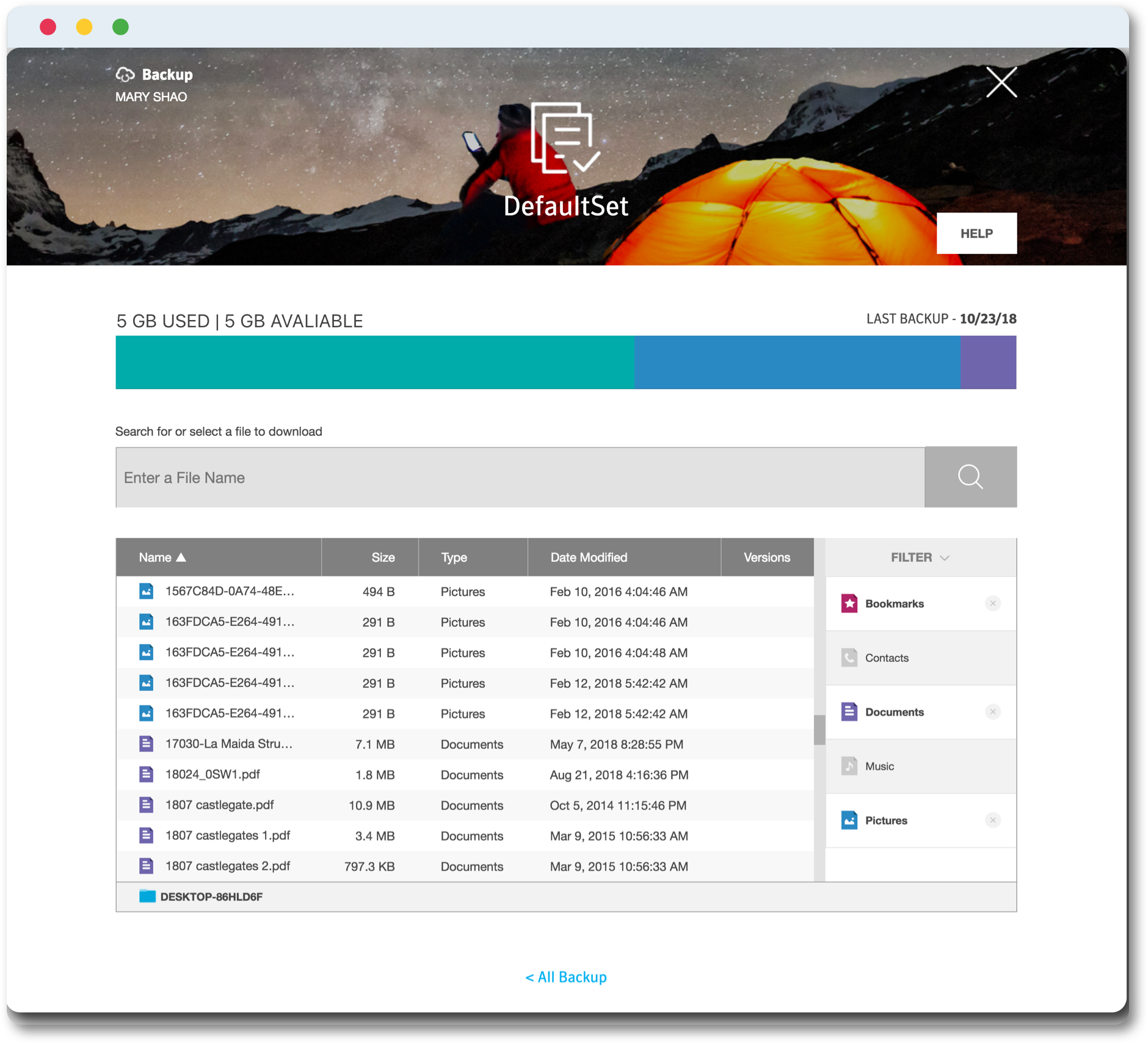
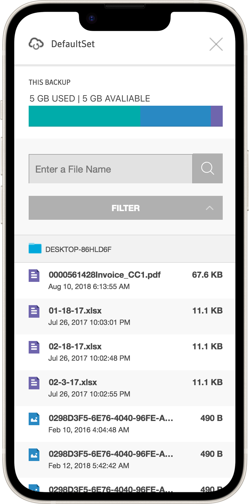
Backup Details
Inside a backup set, users can filter by category, music, photos, documents, and more, then download anything they need.
Results
5 Sign-Ins Became 1
One my.norton.com login replaced every separate product portal.
3-State Health System
Safe, Warning, and Danger read at a glance across every product.
Foundation for My Norton Dashboard
This portal became the basis for Norton's next-gen cross-platform dashboard.
Full Brand Color System
Built the complete brand, functional, and accent color system powering every Norton product screen.