Challenge
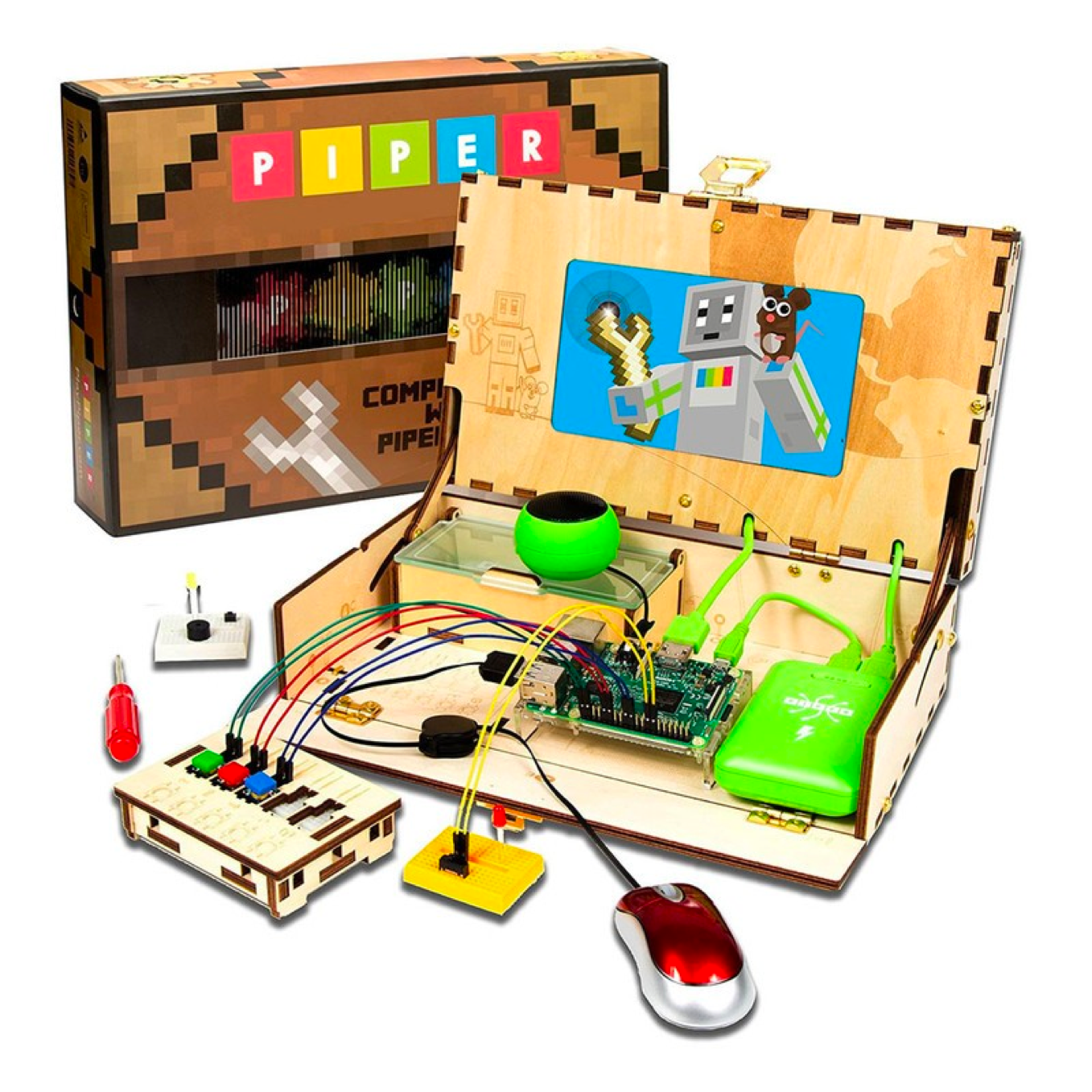
Piper is an early-stage startup developing STEM educational games and hardware to inspire young minds to unlock their creative potential. As Chief Designer, I needed to define the company's entire brand identity from a blank page: logo, color palette, and visual language.
My Role
Chief Designer: defined Piper's entire brand identity from scratch, designing the logo, color palette, and visual language for the company's launch.
Color Theory
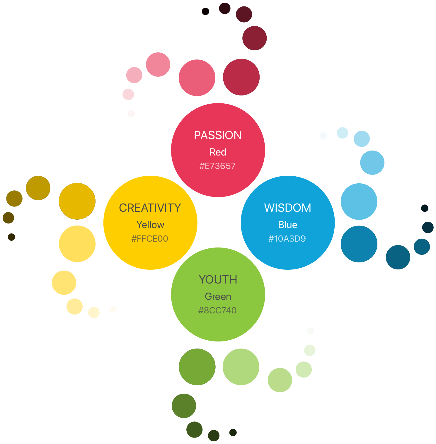
Every brand color was chosen for what it needed to say to a parent standing in a toy aisle: red for passion, yellow for creativity, blue for wisdom, and green for youth. Each color carries its own tint range too, so the palette could stretch across packaging, the website, and the product itself without ever feeling off-brand.
Early Concepts
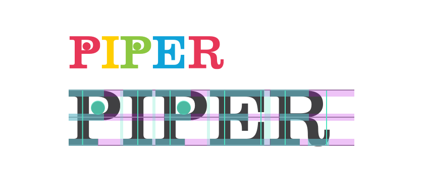
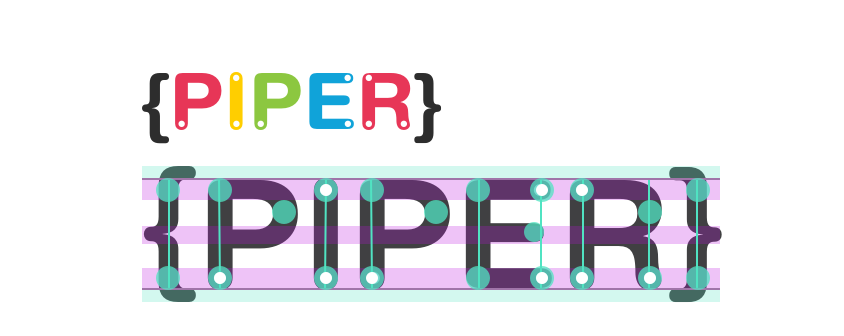
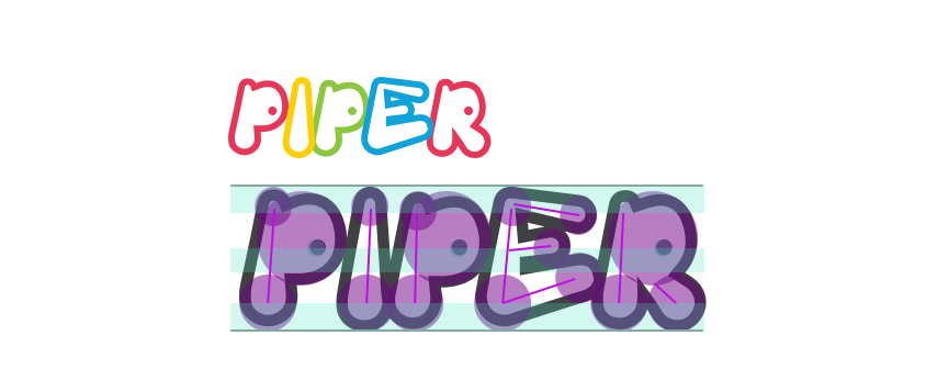
Before settling on a direction, I explored radically different letterforms, from soft rounded balloon type to a mechanical bracket-and-pin system, testing how far the personality of the wordmark could stretch.
Final Design Round
Circles
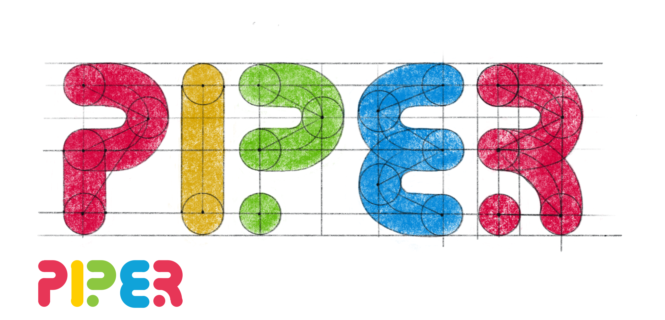
Built entirely from circle geometry, to express the playfulness of a toy brand.
Squares
Final Design
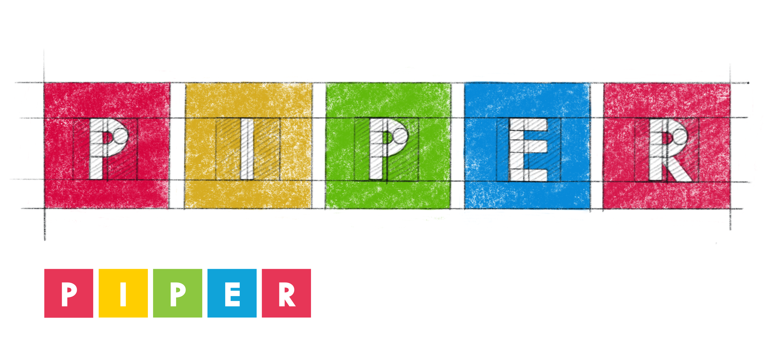
The final logo: rebuilt from sharp-edged squares, inspired by Raspberry Pi circuit boards and the fonts of programming languages, with unified letter weight to convey the unchanging rules of code.
Design Decisions
The circles direction felt more charming at first, but it missed something important: Piper's whole premise is that a computer is something you can take apart and understand. Squares carried that idea, borrowing their geometry from the Raspberry Pi board inside every kit, so the logo and the product spoke the same visual language.